Liquid Disappointment
Yesterday I installed the iOS 26 beta on my iPhone and today, for the first time ever, I’ve downgraded my iPhone back to the stable release. I absolutely hate Liquid Glass; it’s extremely distracting, ugly, buttons are hard to read, and the usability is awful. There are also a ton of visual glitches that I am sure will be ironed out, but I just can’t deal with it in the current state.
Then I read the article Rose-Gold-Tinted Liquid Glasses from famed designer Louie Mantia, and man, he’s hitting the nail on the head. Please read that article.
Here’s how I feel about the things he touched upon.
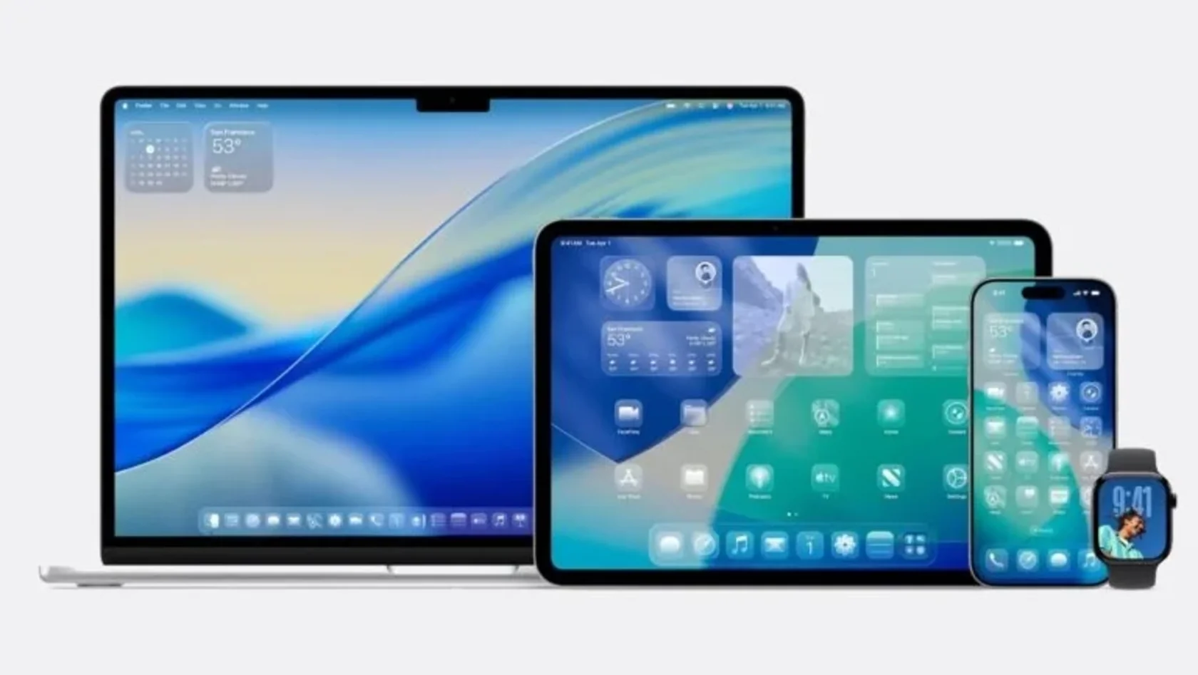
I am not quiet about how much I love my Mac. If I had to choose one device to keep, my Mac is it. That’s why it feels so odd for me to see macOS visually drift so far from where it started. It is macOS that is the backbone of the company. […] Yet, it’s the visual style from iOS and now visionOS that are dictating the visual style of macOS. It does not feel like a breath of fresh air as much as another nail in the coffin.
I really do not understand why visionOS is such a big influence on the look and feel of macOS, iOS, and iPadOS. It’s a niche OS for a product that basically flopped. Why does everything now need to be transparent?
And now, we’ve even lost the ability to make unique icon silhouettes that Apple once specifically retained when introducing the iOS 7 aesthetic to macOS because that was a distinct element of its heritage.
Sadly, almost all of the icons on my MacBook Pro are already rounded rectangles, and the few apps that use a different shape now stick out like a sore thumb. Here are the apps on my computer:
![]()
I don’t know when this shift happened, but yeah I do remember that Mac OS X apps used to have wildly different icons with different shapes. I’m actually surprised that Image Capture, Xcode and Automator have elements that go outside of the rounded rect.
But it used to much more diverse. Remember this?
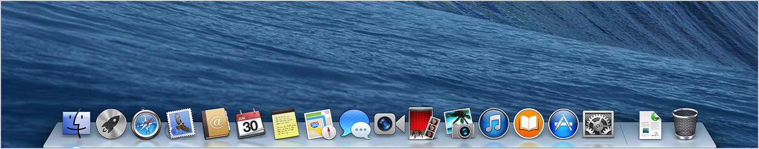
I miss this.
the bar for matching the platform’s visual style is practically nonexistent
Apple used to make such jaw-dropping gorgeous apps. Yeah everyone can make fun of the linnen, wood and leather textures, but those apps were interesting. Every app had its own look and feel. Now every app looks the same. It started with iOS 7 and iOS 26 will only make this worse.
Some details are genuinely really nice. Yet, some of the longest-standing issues remain unresolved. The design team that delivers the broadest change for a three-trillion-dollar company cannot be bothered to consider legibility as a primary function of the operating system?
Oh my God, this really hits the nail on the head when it comes to Liquid Glass: things are simply not legible. Buttons, address bars, tab bars, tool bars.. depending on the background and your scroll position it can be fine, or completely unreadable. And while you scroll, colors are flashing, light is refracting, it’s a technical marvel that doesn’t solve any problems, it doesn’t make anything better.
Apple has effectively infinite resources and operates on their own timeline, but everyone else does not have this kind of luxury. Springing big changes like this all at once forces so many independent developers, entire companies, and the industry as a whole to freeze their own development schedules to accommodate Apple’s design system. It’s asking a lot. For almost nothing in return.
This is one of the reasons why I left Apple development behind and went back to the open web.
I keep looking at all the changes Liquid Glass brings, and I cannot find one instance where it has markedly improved the experience in any way. Everything that got rounder—except for the things that didn’t—why? Everything that got inset that wasn’t before—why? Everything that is now blurry—why? I don’t think it’s a secret that the content area of some apps decreased. The margins and padding increased—except where it didn’t.
Yup, this. Things changed, but it really didn’t get better. One change that I was excited about, was a redesigned Photos app, because iOS 18 really messed up the usability of this app. And yes, Apple did reintroduce a tab bar at the bottom to switch between your library and your albums (“collections”). But the tab bar disappears as soon as you scroll, and gets replaced by a year/month/week switch for your library. Which then disappears when you scroll the other direction. It’s absolutely bonkers and super distracting.
The default tab bar in Safari no longer has a share button, or the tab overview button - they’re now buried inside of a submenu. The URL bar meanwhile is tiny, and almost completely disappears when you scroll, in a very distracting way. Luckily you can switch back to another version of the bottom tab bar which is more like iOS 18, except that it takes more space and has serious legibility issues because of all the transparency.
Apple is creating all these problems while trying to fix a problem that simply didn’t exist.
Liquid Glass and the general implementation of it will not meaningfully change during the beta phase of the “26” release cycle. They’re not going to backtrack. And they’re not going to address long-standing concerns all of a sudden.
I’m afraid that Louie is right. I also don’t think Apple’s going to backtrack these changes, because the people in charge have no taste, no sense of usability, and simply don’t care about all the problems this new design brings. We’re going to be stuck with this look and feel for the next decade, and there’s no way we can all stay on iOS 18 for ten years.
Larger companies may take a hard look at whether it makes sense to have native apps at all versus just web apps. With so much eroded goodwill and Apple profiting immense amounts from third party developers, larger companies may reasonably question the benefit. I think they’d be right to do so. The web’s capabilities likely cover a lot of use cases that many apps need.
Oh, not just larger companies, believe me. I think it’s the smaller devs that are especially fed up, can’t keep up with all the changes, and their disappointment with Liquid Glass will have a much bigger impact on these sort of decisions when compared to a large company.
It’d be nice if they were knocked off their pedestal, because I think they’re better when they’re trying to outdo someone else rather than themselves.
I became a fan of Apple when they were the underdog, when they had something to prove, and made products and software that were miles ahead of the competition. When they cared about users, developers, and design. When their Human Interface Guidelines were celebrated.
Now? They feel like a company chasing visual spectacle over clarity, novelty over usability. I honestly don’t know what it would take to turn things around, but meaningful change certainly doesn’t come from doubling down on bad ideas. It comes from listening, from humility, from a willingness to admit when something isn’t working. Does Apple still have that capacity? I doubt it.
If anything is going to change for the better, I think Tim Cook would have to go, and someone with a deep product sensibility would need to take the reins again.